A unified home for Settings
Redesigning the settings experience so it scales with an expanding set of apps and stays easy to navigate.
Context
Rubrik Security Cloud launched with one flagship app. Then it grew.
The platform started with data protection and recovery, then added apps for threat monitoring and investigation and for data security posture. Settings lived in a dropdown in the top navigation, listing every option. Each new app brought its own settings, and they all landed in that same dropdown.
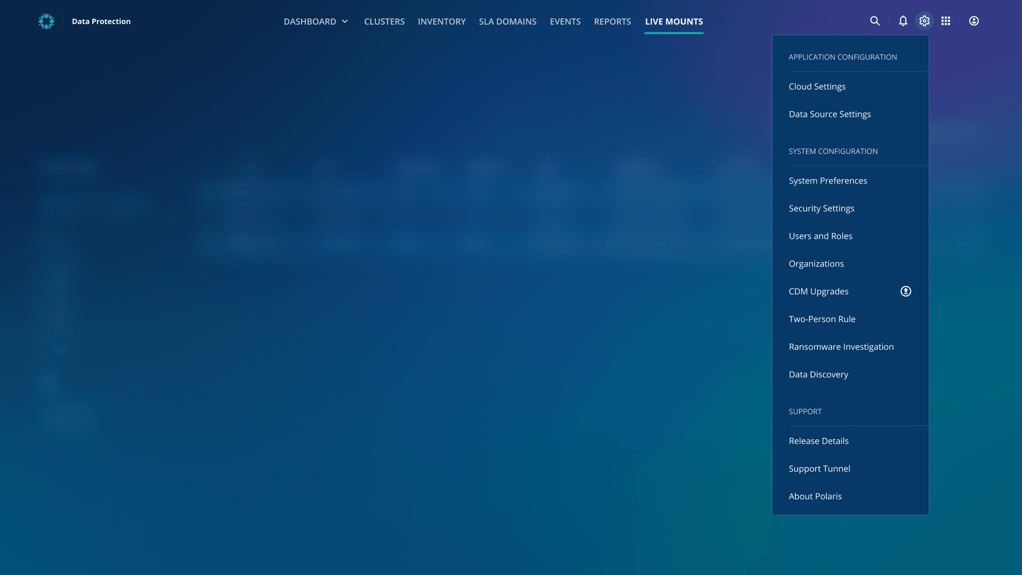
The original Settings dropdown.
Problem
The settings interface had three main issues.
What worked for one app didn’t hold up across several. Admins were spending more time looking for settings than changing them.
- Scalability
Every new app added more settings to the dropdown, making it longer, more cluttered and harder to scan.
- Global settings that looked app-specific
Settings looked the same in every app and were opened from the same top navigation inside each one. That implied they belonged to the app you were in, when they actually applied across the whole platform.
- Misleading categories
The grouping reflected how the product was built, not how admins think, so customers struggled to find the settings they needed.
Solution
A comprehensive redesign of how Settings is reached, organized and used.
Centralized access
Settings moved into the App Switcher, alongside every other Rubrik app. That makes it clear Settings is a global control, separate from individual applications. Opening it now leads to a dedicated space instead of a dropdown inside whichever app you happen to be in.
Intuitive navigation, better information architecture
The new Settings Room has a searchable side navigation, with categories redefined through user research and extensive card sorting, so settings are logically organized and easy to discover.
Users can switch between settings and sub-settings without losing context, and collapse the side panel to focus while configuring.
Workflow integration
Back links take users who drill into Settings from another Rubrik app straight back to where they were, keeping their journey uninterrupted.
Outcome
Customers called the new interface easy and intuitive, and the back links were a particular favorite.
The redesign resolved the scalability and information architecture issues and made managing settings feel integrated into users’ daily work.
It wasn’t without challenges. Moving every setting into the new side navigation required extensive refactoring, far more than first expected, and close collaboration with engineering to get there.